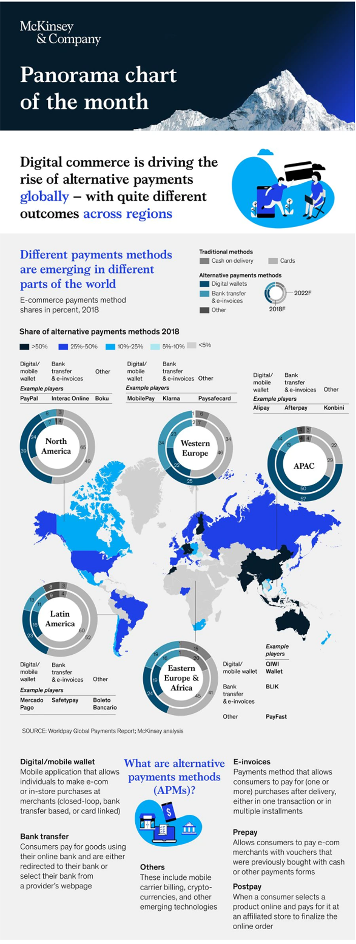
McKinsey is a Global management consulting firm that offers professional services to corporations, governments, and other organizations. With technical information, research and loads of numbers, their marketing and design team has been making their website content visual, creating infographics for various industries, topics, and trends. While some of these may be somewhat uninteresting for anyone other than their clientele, McKinsey has made it accessible, entertaining, and easy to understand for all users. Importantly, their website also makes use of smaller data visualisations which has been recreated as interactive content.
Infographics are important as they allow the publisher to present rational information in a visual way, increasing its likelihood of being remembered. Living in the information age, in which we are constantly bombarded with data, creating data visualisations such as McKinsey’s example on the left, can aid people to understand complex information and statistics visually. Taking one step further and creating interactive data visualisations on website can also help bridge the engagement gap by pulling users directly into the content by requiring their engagement and providing them with something valuable in return. With creativity, interactive content can have users engaging more readily, providing more information, and building connections with the brand.
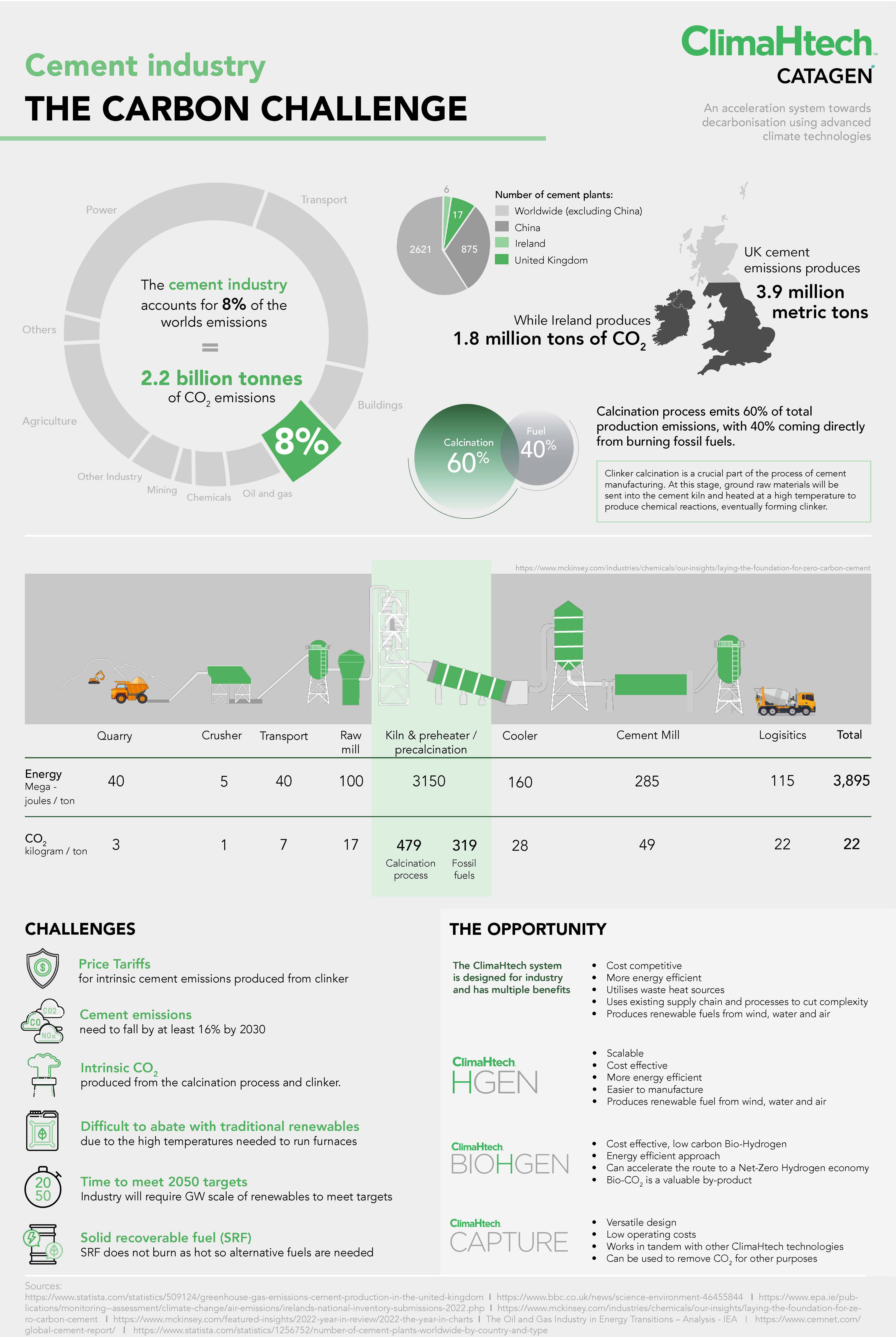
McKinsey, as well as ‘Information is Beautiful’ and David McCandless has been a valuable resource while working in the technology industry, where I’ve been using infographics to educate, showcase the companies knowledge and visually present statistics on why Net Zero fuels are needed in industry. You can see one of my infographics below which focuses on the cement industry, highlighting it’s emissions and need to decarbonise which not only speaks to potential customers but also to the general public.
“I feel that every day, all of us now are being blasted by information design. It’s being poured into our eyes through the Web, and we’re all visualizers now; we’re all demanding a visual aspect to our information. There’s something almost quite magical about visual information. It’s effortless; it literally pours in.”
― David McCandless