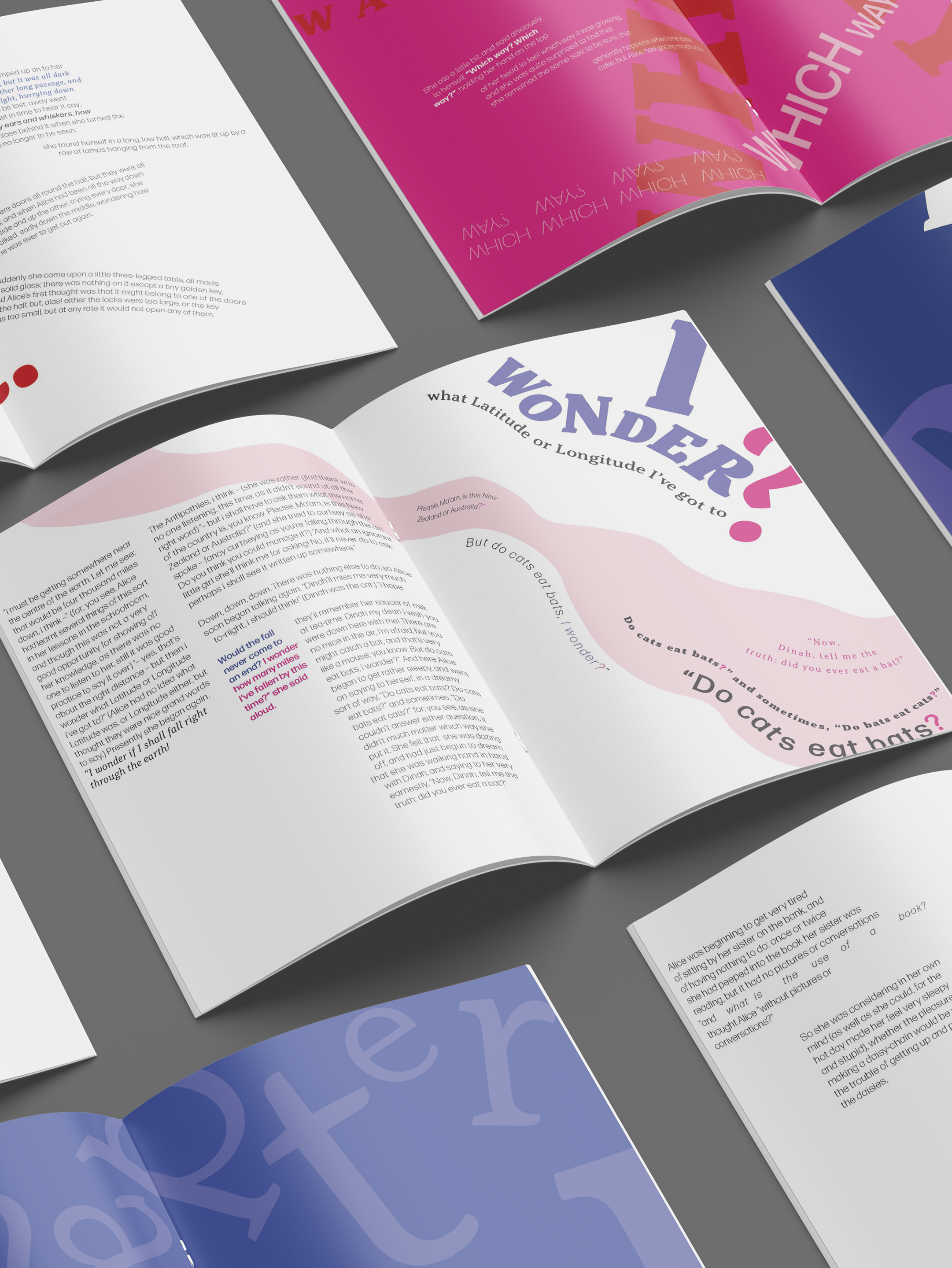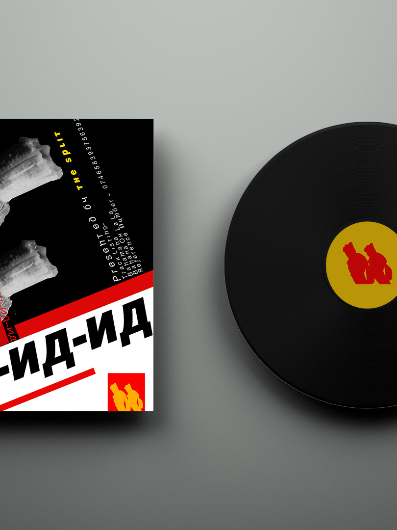


My allocated design studio was Experimental Jetset, a design agency based in Amsterdam and was founded in 1997 by (and still consisting of) Marieke Stolk, Erwin Brinkers and Danny van den Dungen. A design agency focused on typography and “turning language into objects", designing printed matter and site-specific installations.
I selected Helvetica as my typeface as Experimental Jetset famously used this typeface in their work continuously, believing that Helvetica’s combination of neutrality and self-reference allowed their viewers to focus on the design as a whole and kept “the concept as clear and pure as possible”.
Black and white was selected as the main colour palette with red and blue as accent colours. Importantly, I made use of a modular grid and asymmetrical layout which was key to Experimental Jetset’s modernist inspired designs. A mixture of bold and regular weights was used on the front design while crossing out of words was also incorporated on the back design as this was also a familiar trait of their work, creating interest. My final front design focused on connecting and creating ‘objects’ with the letters highlighting their methodology and statement.
I chose matte vinyl stickers as my method of print, as this allowed me to play with and connect the letters when applying.